1
HOME > Trends >
HOW TO SUCCESSFULLY TRY OUT PINK MENSWEAR
Written by Ivan Yaskey in Trends on the 13th September 2023
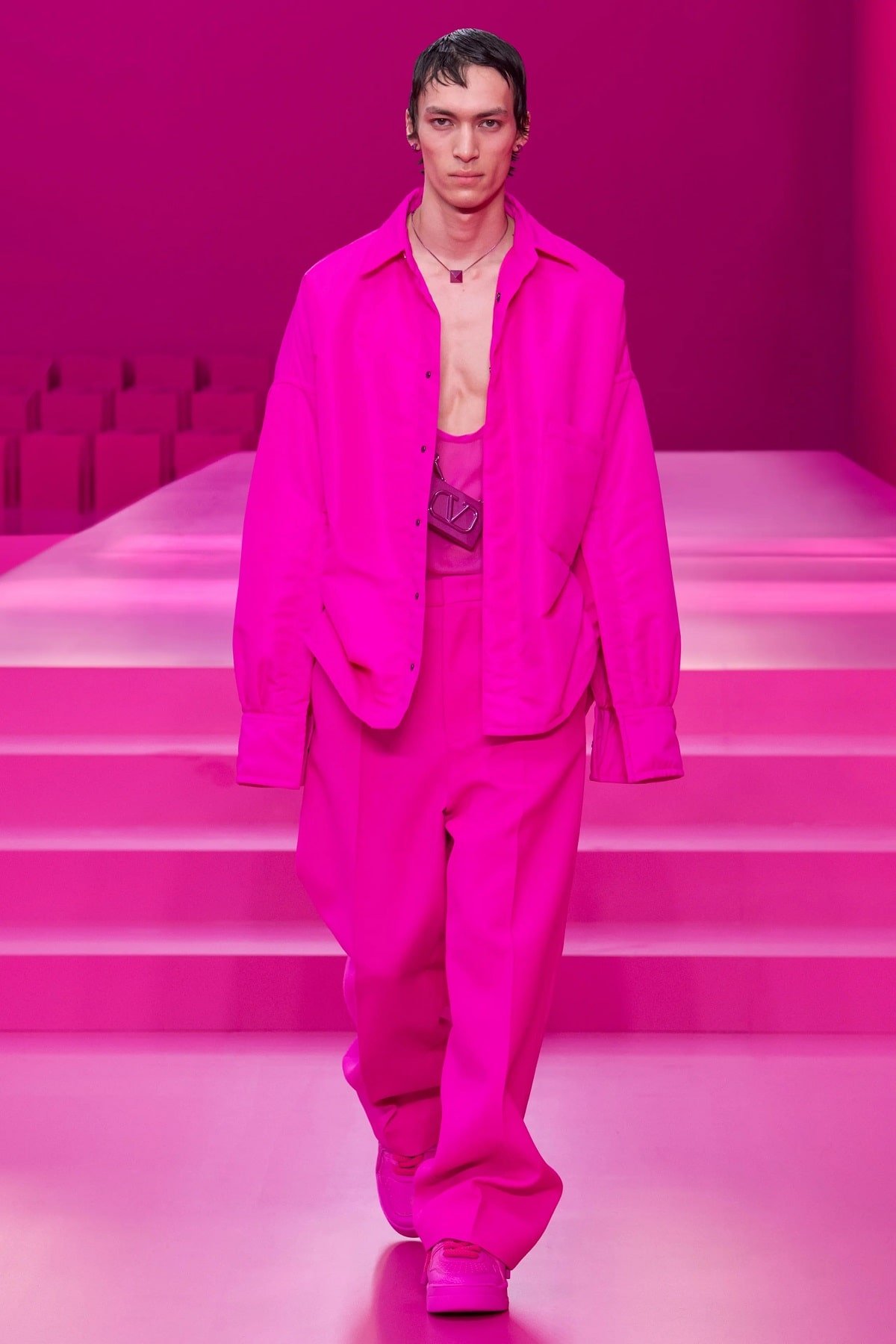
Colors come with specific associations, whether that’s the banal yet versatile neutrality of white, tan, and gray or the craziness, yes-I-dare attitude of cobalt or even the deceptively subdued lavender. Beyond these initial visual impressions, however, those assumptions go deeper, often intertwining with gender expectations and what men and women should and shouldn’t wear. Thus blue in all forms gets relegated as a men’s color, especially for children, and pink slithers solely within the domain of womenswear. Trends and collections challenge this – whether that’s the blush shades added to silky, pajama-like suits from Dior just a few seasons ago or the sudden entrance of the pink button-down and polo in the 2000s. Sometimes, ruffles and lace dress it up and push boundaries; at others, it fits the rules through florals or geometrics. In a third category, it intentionally creates a stark juxtaposition: a traditionally masculine silhouette – think the suit – injected with a rose, millennial, or even magenta shade.
Now shaping the conversation is the Barbie movie that dropped a few weeks ago that, despite the veneer of obvious commercialism, sends viewers to a pink-coated fantasy land populated by dolls who talk and a Ken, played by Ryan Gosling, in perfectly coordinated sets that, let’s be honest, wouldn’t look out of place in a resort collection. Although the movie delves into big-picture themes of gender and toxic masculinity, it’s revived the whole “femininity in menswear” conversation that starts, rises, and then runs dormant after a year or so. Pink feels like a direct conduit for treading familiar territory:
Pink in Men’s Fashion
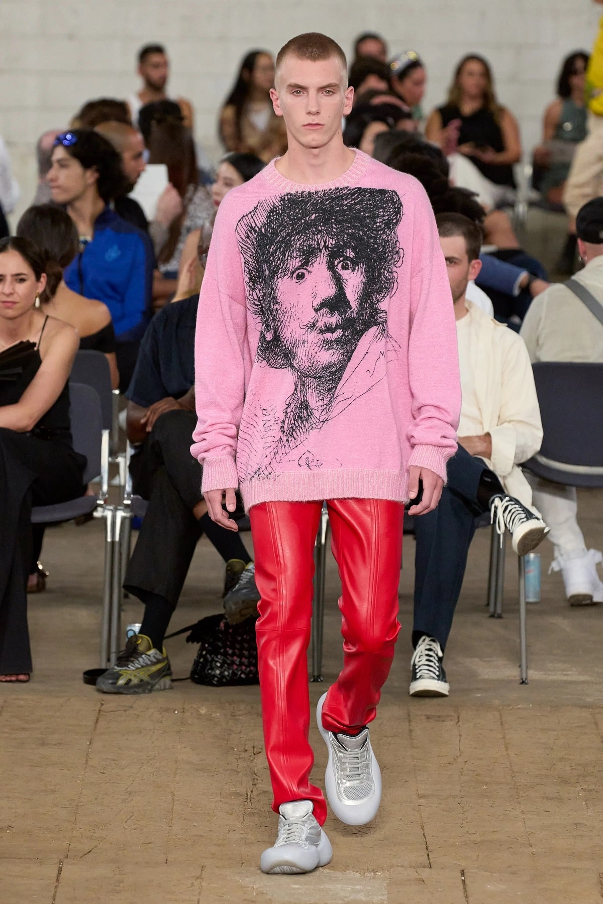
Anyone who’s skimmed a menswear blog or picked up a fashion magazine with some sort of pink-themed spread has run into the following fact: Up through the first half of the 20th century, pink was either considered a boy’s color, especially during childhood, or didn’t carry around gendered associations. Marketing that ramped up in a post-World War II United States started pushing this narrative, along with stronger dividing lines for toys. Although this path veered periodically – for example, gender-neutral toys and clothing using just primary colors in the ‘70s and the you-can-do-anything girl-power attitude of the ‘80s and ‘90s that extended from science kits to the Spice Girls – it progressed to the point that the girls’ section of a toy store exists strictly in a realm of pinks and purples and various princess motifs. The dividing line starts to blur in adulthood – think the gender-neutral appeal of hoodies, joggers, and even ball caps in navy or gray – but pink, at best, toes the line. It’s an experimental shade that only the most confident wear. In this sphere, pink splotches preppy fashion – think the Vineyard Vines whale logo, solid pastels in the ‘80s, and light-colored madras prints – and feels more acceptable to wear in summer, or if you’re showing support for breast cancer awareness. Through a print or pattern feels more acceptable – after all, the whole shirt doesn’t feature pink – or in a darker, dusty form that implies age, wear, and some sort of story.
Combining Pink With Other Shades
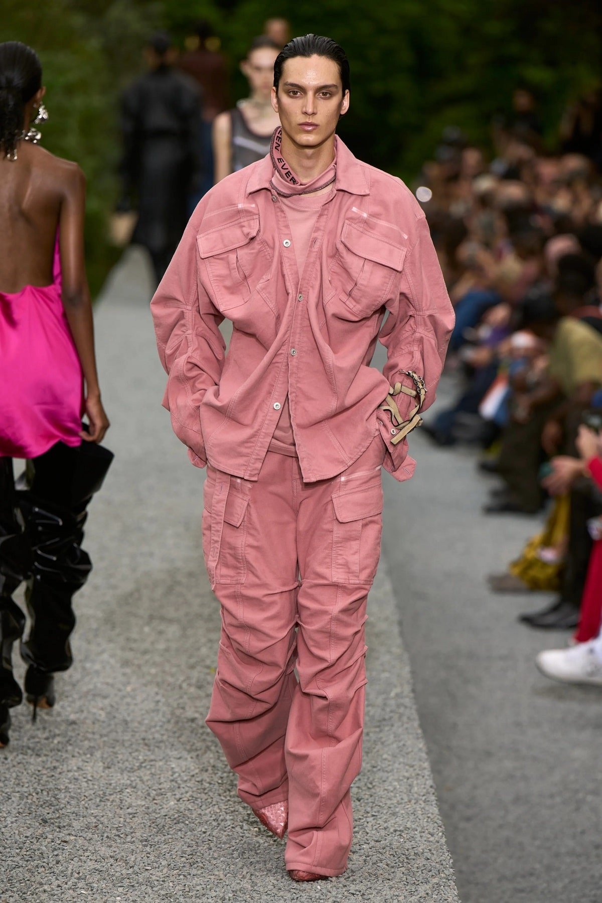
So, you’re not afraid of pink. Maybe you’re appreciative of the gender-neutral direction of men’s fashion in more recent decades, or you’re experimenting with the Barbiecore aesthetic found on TikTok. In these and other cases, figuring out how to wear pink and not look awkward or gimmicky comes down to two factors: the shade and what you pair it with. We tend to group pink in with pastels, unless it’s something like magenta or fuchsia, which, in that case, it’s more of a bold or neon hue. Associations and how to integrate pink come down to season: lighter, muted, pastel, and peach-like shades fit the character of summer, and deeper, more intense variations veering toward purple feel apt for winter.
From this point:
- Realize that pink’s tonal spectrum comes down to the percentages of red and white, with the former adding more intensity. Blue can make it more neutral, and pull it toward mauve. Yellow and orange undertones up the brightness, and might even take out the feminine connotations. Keep these points in mind as you build the rest of your ensemble.
- While most classify pink as more of a specialty shade, it’s one of the most versatile based on the amount of red or white and any undertones, pairing with grays, blues, navy, greens, tans, browns, white, yellow, and charcoal and even with red, pink, or purple variations, like burgundy.
- Start with your skin tone: Deeper, darker pinks complement lighter, paler skin, and more intense or pastel versions suit someone with a tan or darker tone.
- Despite this, pink continues to feel experimental. You’re advised to anchor it with a contrasting shade – for instance, blue or navy, gray, a dark green, tan, or white. Mixing it with other pastels looks a bit ‘80s, while going monochrome – pastel pink, fuchsia, and red, for example – can be done but isn’t for the faint of heart.
- Don’t be afraid to mix prints incorporating pinks: Look for similar shade intensities among two disparate configurations, like narrow stripes and bold florals.
Grades of Garments
Obviously, you’re not going to go all in right from the get-go. Instead, based upon how much pink you already have in your wardrobe:
- Accent it with an accessory: Pocket squares, ties, cufflinks, socks, and belts all form the gateway toward exploration. Here, think of pink as a light dash of pastel on a neutral charcoal or navy. It’s a surprise and offers some intrigue without bulldozing the rest of your style.
- Via your shirt: You have two choices here. One, give pink the dress shirt treatment: Classic frame, slimmer, structured silhouette, and a light to dusty hue that feels as if you’re dabbling with femininity in neutral terms. This isn’t Barbie cosplay, but more like you’re blurring the line between run-of-the-mill white and candy-apple red. Or, take the backroads route with a pattern: It’s the winding justification of trying out a women’s shade in the context of something more masculine, like plaid or even beach chair or Breton stripes. As a third choice, pink plus a floral print ultimately communicates your dissatisfaction with gendered boundaries: After all, why should some random bro-dudes tell you how to manage your wardrobe?
- Trousers: Surprisingly, we were spotting pink trousers and denim everywhere a few years ago. In this context, a light or dusty shade falls in the bounds of pastels and either evokes an ‘80s preppy character or adds a rosy complement to the textured twill material.
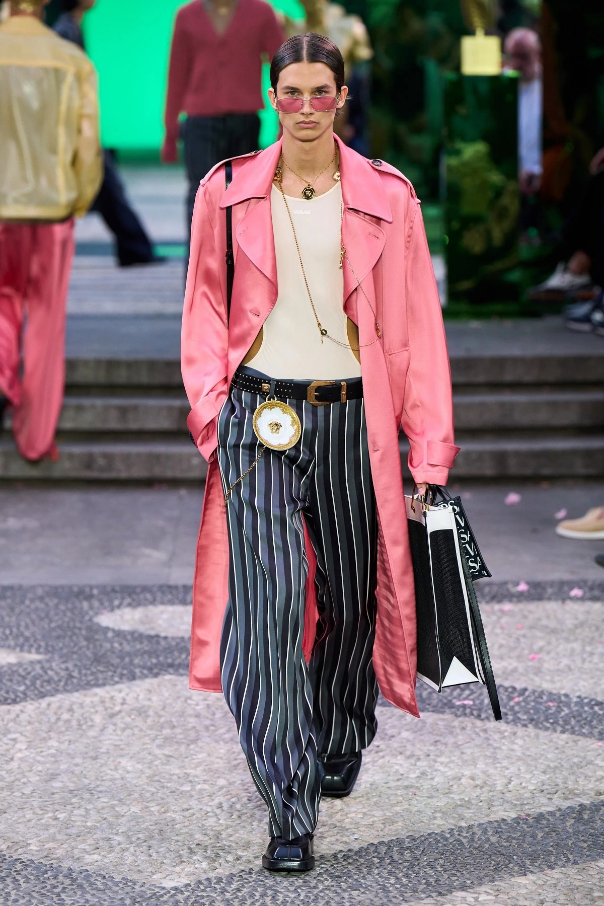
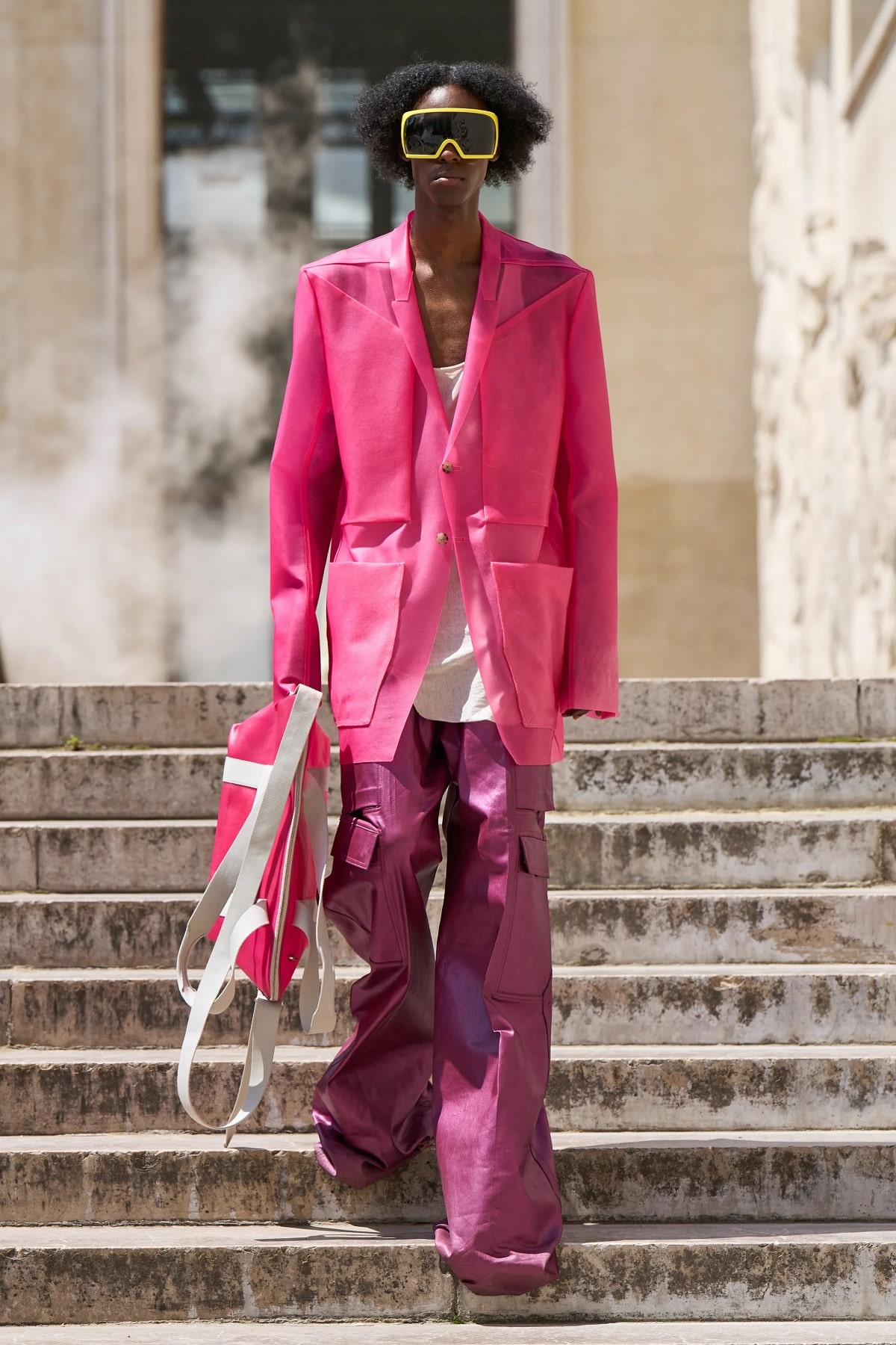
- Blazers, jackets, and suits: Why take the traditional route when you’re confident in your masculinity? Yes, Dior and Harry Styles have given us some inspiration, but beyond the louchey and ‘70s vibes, a champagne tint to a blue-leaning mauve feels like the perfect foil to the holy grail of menswear and delivers the perfect confluence of masculine form and feminine trappings.

Trending
2
3
4
5
6
7
8
9
10


